


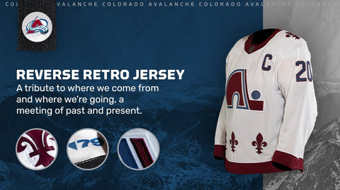
Last Monday, the National Hockey League and its official uniform supplier, Adidas, released new third uniforms for all 31 active teams (the soon-to-be Seattle Kraken excluded), dubbing this set the "Reverse Retro" line. The idea was seemingly to take a popular or cult element from a franchise's past – be it a particular colour, logo, etc. – and mash it up with the present. Franchise is a key word as many teams riffed off elements from previous incarnations in other cities. For example, the Colorado Avalanche took the now-famous Quebec Nordiques uniform and put it into their colourway:
The result is awesome, at least from an aesthetic standpoint... I'm not sure hockey fans in Quebec City will appreciate their beloved fleur-de-lis being used by the city that took their club away. In any case, the most successful Retro Reverse uniforms are the ones that have taken two very different eras and blended them together. One other prime example is the Minnesota Wild, who mixed the green-and-yellow of the state's previous team, the North Stars, with their current primary logo:
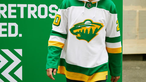
The result is something bright and bold that celebrates the past while remaining linked to the present.
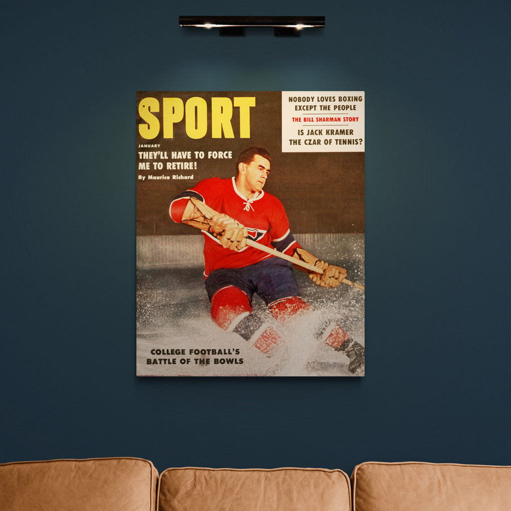
As lovers of sports history, we at The SPORT Gallery certainly applaud the NHL for their attempt to turn contemporary fans on to vintage design. However, not every Reverse Retro look was as successful as the two we've shared thus far. As it happens, most of the Canadian teams' new thirds have been critiqued for different reasons. Here and now, we're going to focus on the Maple Leafs and what they could have done differently.
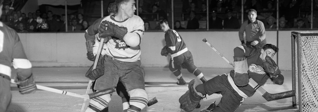
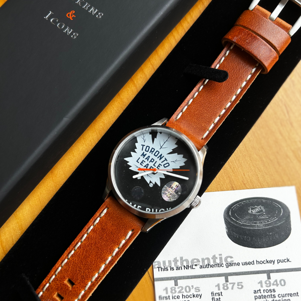
The Leafs' Reverse Retro jersey (we've yet to see the full uniform thus far) is a blend; the logo is based on the late-1960s iteration, which was worn when they last won the Cup in '67, and the jersey itself looks like that of the '70s and '80s. A big stripe comes up from the cuffs all the way through the neck, and there's blue leaves on each shoulder. The only way the jersey is "remixed," apart from pre- and post-1970 elements being combined, is that instead of white as the secondary colour to blue, we've got grey, which is new to the Leafs:

It's not a bad look by any means, but could they have done better? Many have voiced their disapproval on social media, so the general consensus seems to be yes.
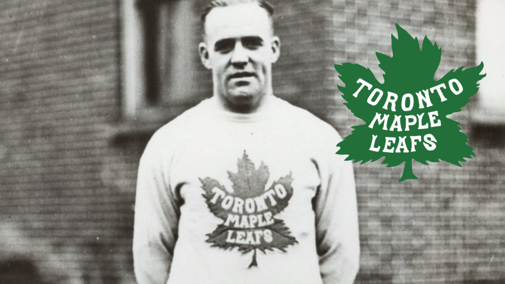
Our thought is this: the Leafs should have looked to their uniforms from 1927 as inspiration. That year was the first of the "Maple Leafs" nickname, a result of Conn Smythe taking over the franchise, which had been the "St. Pats" for the previous few years. Being a military veteran, Smythe viewed the maple leaf as a proud national symbol, which influenced his decision to rename the team. But, during his first year of ownership, Smythe still wanted to show a sign of respect for the previous organization, and thus decided to keep the St. Pats' green and white colours for the remainder of the season. This was the result (according to nhluniforms.com):

Smythe's decision created a "mash-up," in a funny way, bringing together the now-iconic Maple Leafs with that of the St. Pats. The current Leafs staff have done a good job of celebrating their previous identity, so most know of the St. Pats at this point. The single year of the Leafs being green is, however, sadly not widely known of. We propose mashing it up further, bringing in the logo from the '30s, with the full wordmark within the leaf (of the same shape), perhaps with some striping, to spice it up.

Whatever the particulars, the Leafs could and should have gone with something that's more of a departure from their modern identity. The teams that did that, like the Nordiques and the North Stars, ended up at the top of the Retro Reverse uniform rankings, which is not where the Leafs can be found currently.